Hints, Tips and Solutions
Q: How to better visualize vectors and field lines in TonyPlot?
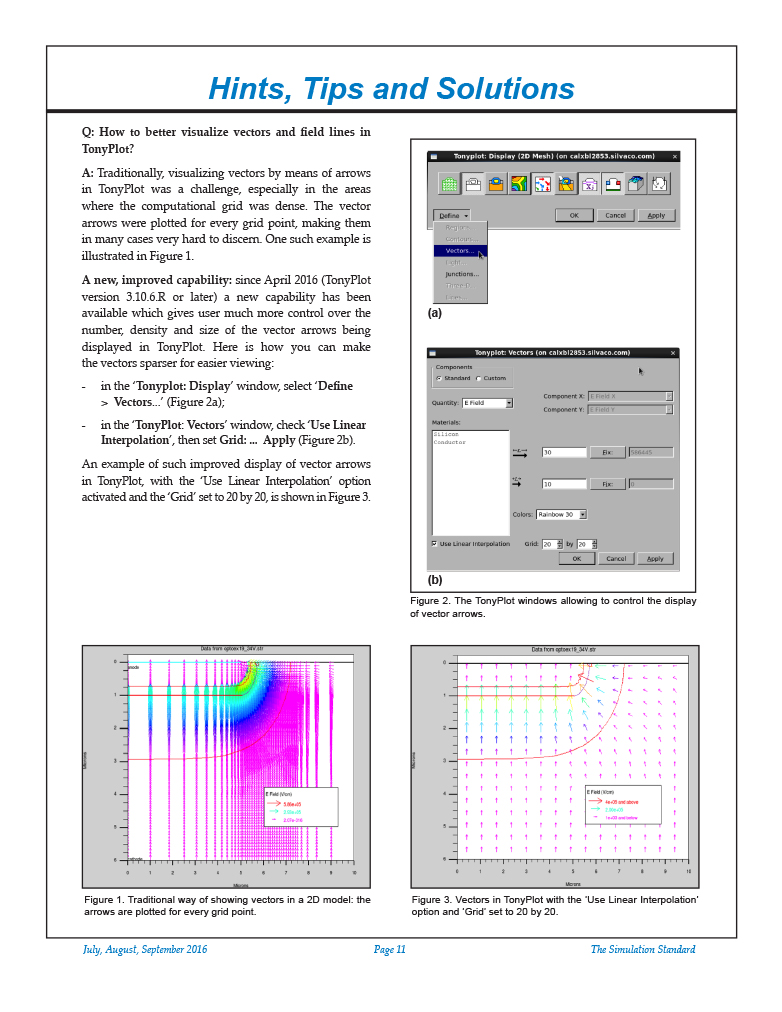
Traditionally, visualizing vectors by means of arrows in TonyPlot was a challenge, especially in the areas where the computational grid was dense. The vector arrows were plotted for every grid point, making them in many cases very hard to discern. One such example is illustrated in Figure 1.
A new, improved capability: since April 2016 (TonyPlot version 3.10.6.R or later) a new capability has been available which gives user much more control over the number, density and size of the vector arrows being displayed in TonyPlot. Here is how you can make the vectors sparser for easier viewing:
- in the ‘Tonyplot: Display’ window, select ‘Define > Vectors…’ (Figure 2a);
- in the ‘TonyPlot: Vectors’ window, check ‘Use Linear Interpolation’, then set Grid: … Apply (Figure 2b).
An example of such improved display of vector arrows in TonyPlot, with the ‘Use Linear Interpolation’ option activated and the ‘Grid’ set to 20 by 20, is shown in Figure 3.
Viewing the Electric Field Lines Within the Depletion Region
This capability is often important when analyzing impact ionization and avalanche breakdown phenomena.
First, for such analysis, it is often useful to display the depletion region boundaries:
- in the ‘TonyPlot: Display’ window (Figure 2a) , select ‘Define > Junctions…’
- in the ‘Tonyplot: Junctions’ window, click on ‘Depletion Edges’ … Apply.
In order to visualize the electric field lines (and ionization integral) in the depletion region:
- in your input deck, use a statement like this:
output impact e.lines iname=anode n.lines=50 - once the simulation is completed and you open the resulting .str file in Tonyplot, activate (click on) ‘Lines’ in ‘Tonyplot: Display’ window,
- you may turn off ‘Contours’ and ‘Regions’ in ‘Tonyplot: Display’ , for a clearer view of the field lines and the ionization integral values (represented by colors).


